StuckonEDU
Brand Strategy & Visual Identity
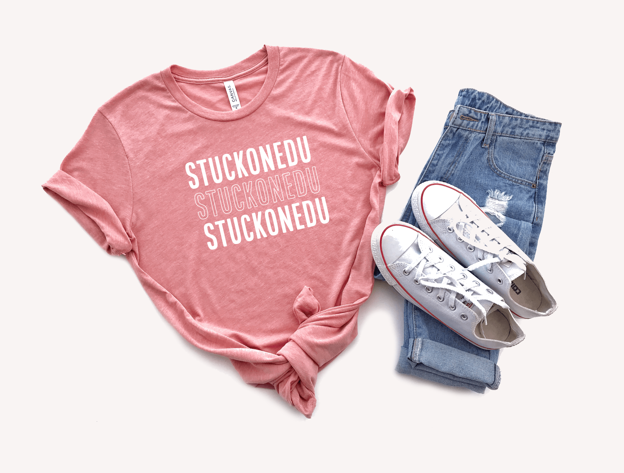
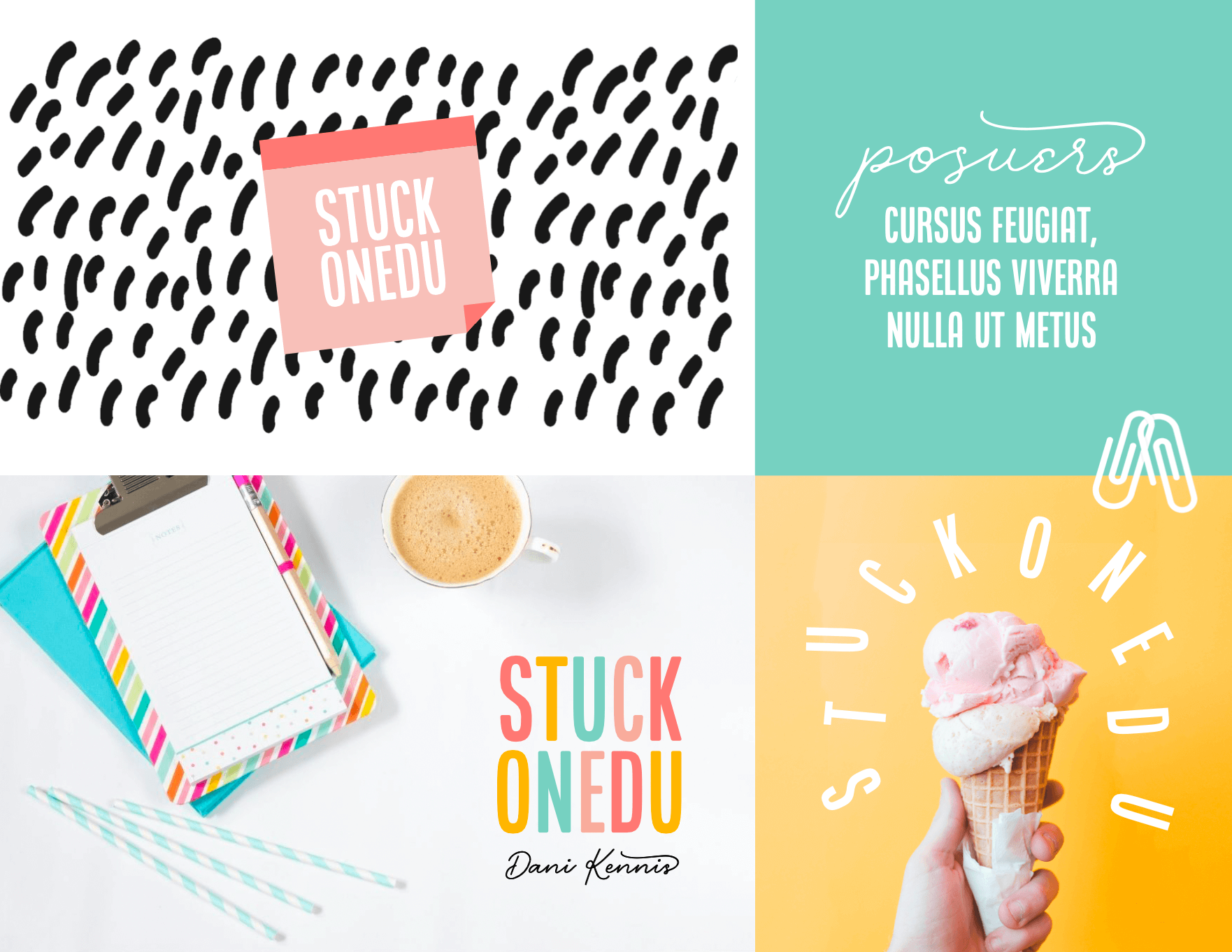
Launch Graphics
StuckOnEDU is an educational support business that helps secondary teachers create and deepen quality relationships with their students through active, fun, and interactive resources that motivate greater engagement and reflection.
StuckonEDU is all about helping teachers with resources that help them better understand and motivate their students through the building of authentic relationships.

When Dani and I started working together, she told me her branding felt disconnected. The StuckonEDU brand had been growing, but it didn’t feel cohesive, and she was looking for a new design vision.
To clarify brand messaging and the best direction for brand visuals, we focused on key storylines within the StuckonEDU brand — and a love for brainstorming, ideation, and sticky notes rose to the top! We wanted a bright and energetic brand that appealed to educators and a secondary education audience, while also tapping into the creative brain space of design thinking studios.
BRAND KEYWORDS
RELATIONSHIPS - VALUE - ENGAGE - MOTIVATE

DANI KENNIS
"None of my work felt cohesive or connected. It all felt so amateur. Stacy truly understood me, my brand, and what I valued. She executed my vision and tapped into every single detail in a way that was authentic, creative, and true to my brand.
She honored my vision with a precision and depth I couldn’t have imagined, paying such careful attention to the details of every piece of my brand identity. Every color choice, font choice, and detail of my logo and elements are so uniquely ME.”
VISUAL DIRECTION
The branding for StuckOnEDU was designed to be bold and playful. It appeals to an academic audience, but stands apart as a resource for secondary teachers looking for interactive resources that motivate greater engagement and reflection. The brand concept shows off the balance between a playful color palette with a bold and powerful black. The “on” sits on top of the “edu” as if it’s stuck in place, and all three pieces of the logo are positioned in a modular grid fashion, similar to how sticky notes are placed on a board during a major brainstorming session!