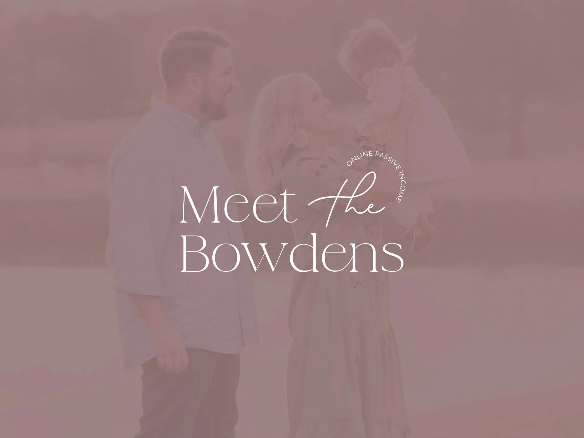
Meet the Bowdens
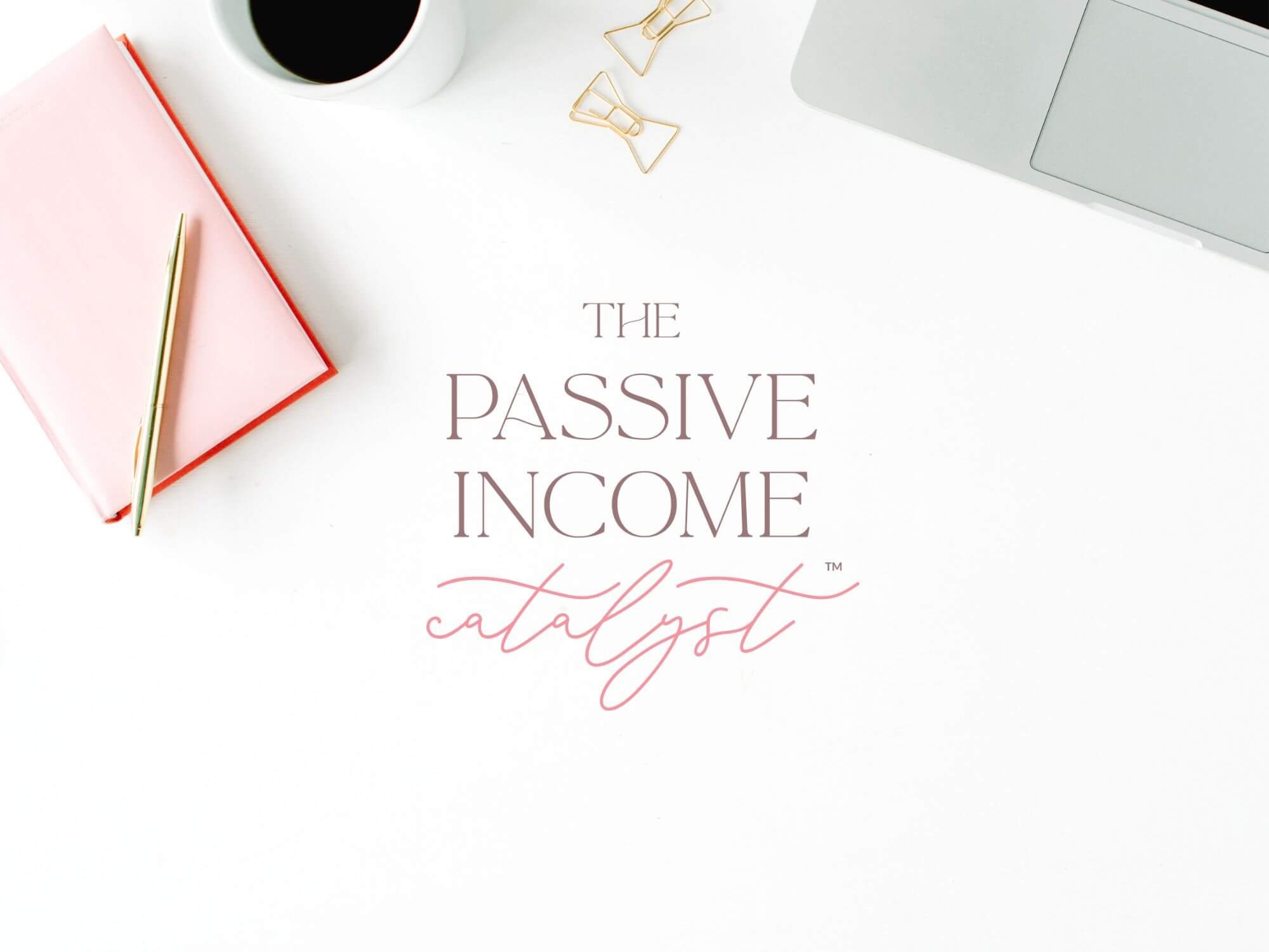
Brand Strategy & Identity
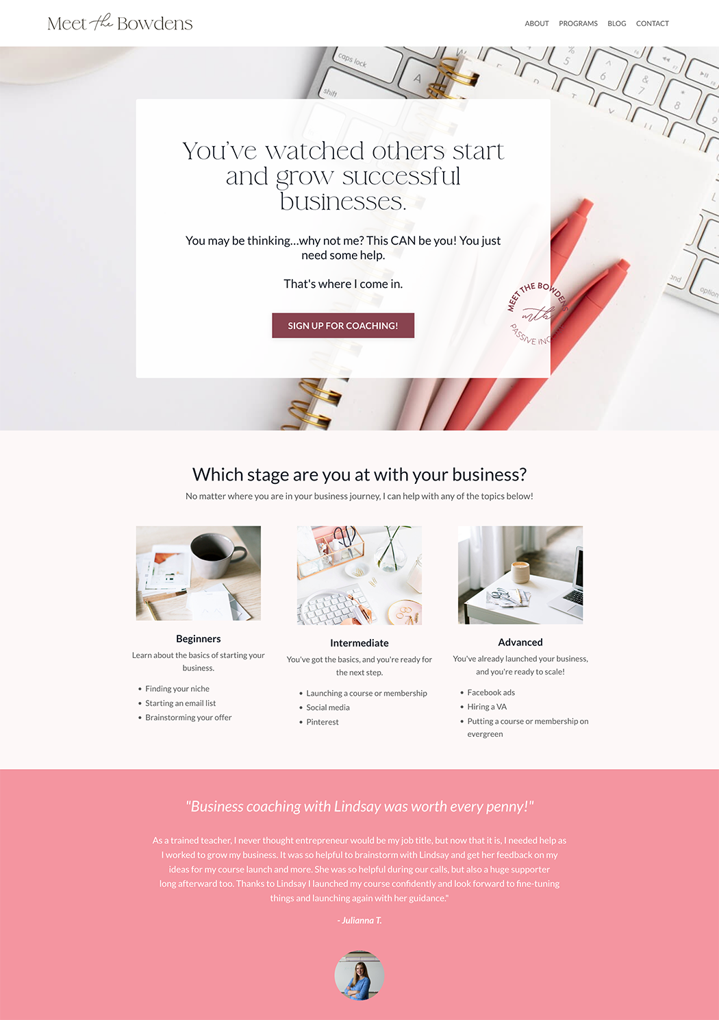
Website Design
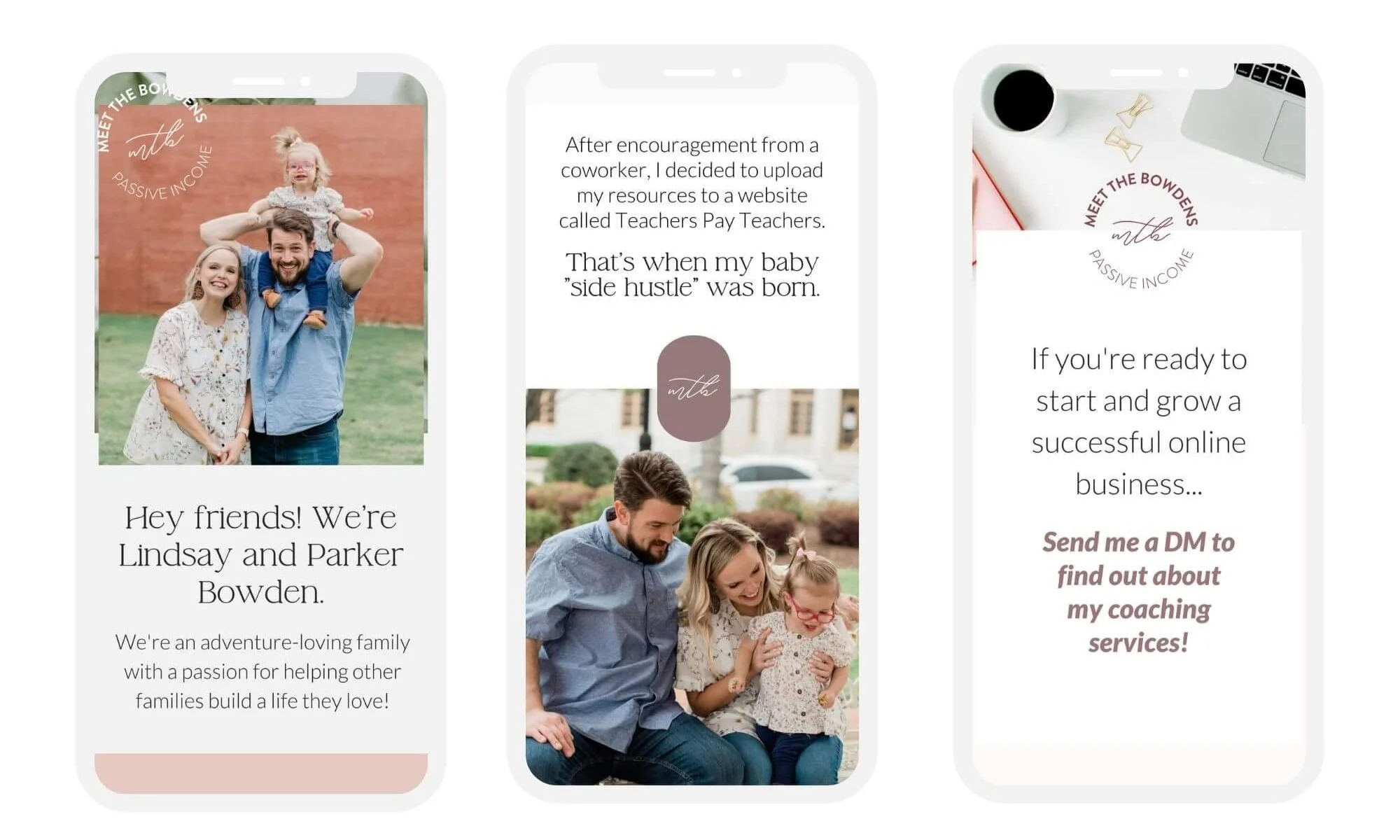
Promotional Graphics
UX/UI
Meet the Bowdens is a lifestyle brand for families seeking to live with more financial freedom and to reclaim time to build a life they love.
It is their mission to empower families to start and grow online businesses that earn passive income, so they can finally live in financial freedom and build a life that fits their desired lifestyle.

When Lindsay approached me about launching a new business, we had already worked together on her amazing math curriculum business.
But now, we had the opportunity to start from scratch on a new concept she was so passionate about. We started with a brand strategy phase, which focused on defining her brand archetype and thus, understanding her unique brand voice. Using this understanding, we built a full brand identity, website, and course visuals for her all-Kajabi platform.
BRAND KEYWORDS
PASSION - FREEDOM - FAMILY - MEMORIES


LINDSAY BOWDEN, Meet the Bowdens
“I was super overwhelmed with all the pieces of creating a new business. I knew I wanted to handle the content and let a professional handing the look and design of the brand. I know my content will be really useful to so many, and I wanted the visual aesthetic to match the content!”
“Stacy is just so good at what she does! She has some of the best design skills I've seen. I love how she keeps everything simple while still making it look professional and polished. I feel a HUGE weight has been lifted. Now that I have a professional, beautiful brand, I can focus on my area of expertise."
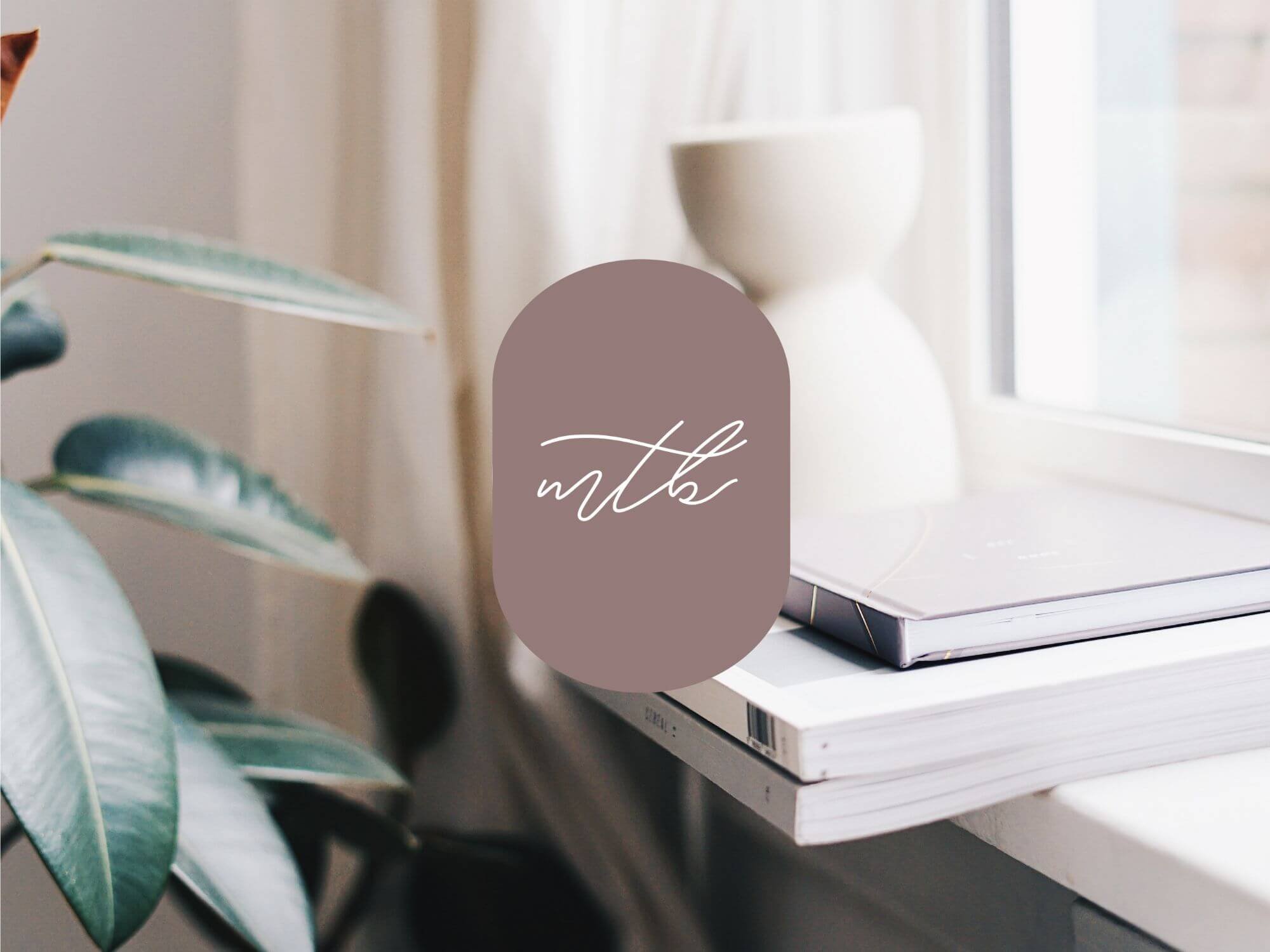
VISUAL DIRECTION
The branding for Meet the Bowden’s relies on the cross-section of being both the Sage and the Adventurer. We wanted to create a brand stood out as an authority in its niche, but also be approachable and family-centric. Their focus on creating financial and time freedom connects well with the adventurer brand archetype, which we showcased throughout the design elements, images, and storytelling. To extend this storyline of the adventurer with time flexibility, we integrated organic marks that resemble a mountain throughout the brand. Minimalist in nature, the MTB brand colors and font choice lends itself to a more female audience, while the muted color tones can also connect with a Bohemian family lifestyle.